Home Design Color Trends for 2018– Moving Away from Neutrals
Home Design Color Trends for 2018– Moving Away from Neutrals
Both fashion and home design color trends are largely driven by what is happening in the world. The year 2017 climate has been chaotic with environmental wraths and death and devastation. For this reason it is understandable that that Pantone, the world authority in color trends since the year 2000, has selected uplifting shades and feel-good tones for 2018.
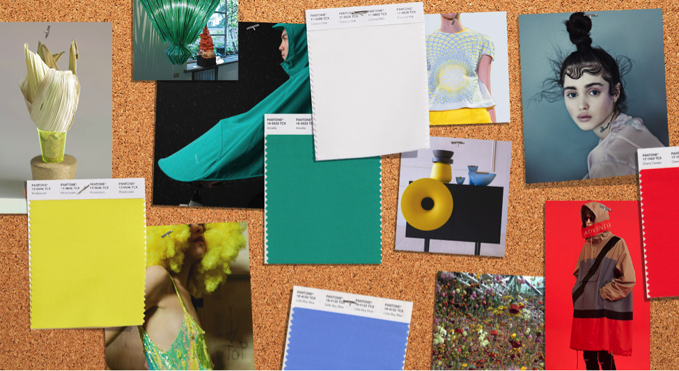
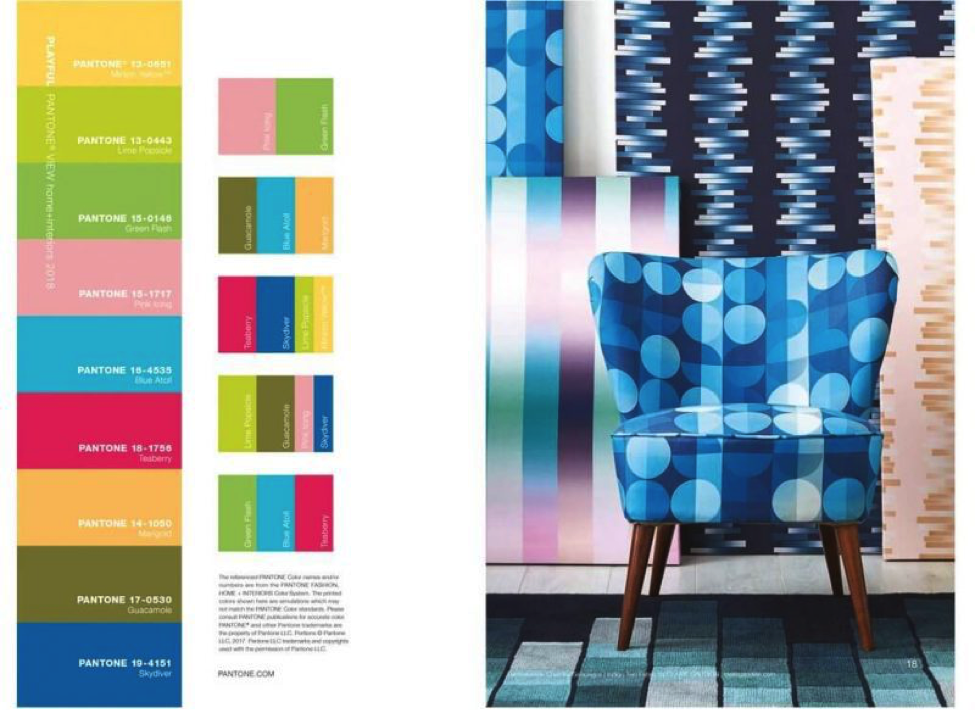
Pantone’s 2018 COLOR OF THE YEAR “breaks free from typical thinking.”
Pantone’s research has shown that consumers no longer want to feel limited by traditional color guidelines. They want to experiment with color, to blend, mic and create unexpected combinations.
They also want a release from the fears of the world and want bright, fun and playful colors.
Benjamin Moore’s 2018 COLOR OF THE YEAR “ is total confidence.”
Benjamin Moore had already broken away from neutrals, shocking many, with their 2017 Color of the Year — Shadow. Now the firm has selected another surprising hue for its 2018 Color of the Year: Caliente AF-290.
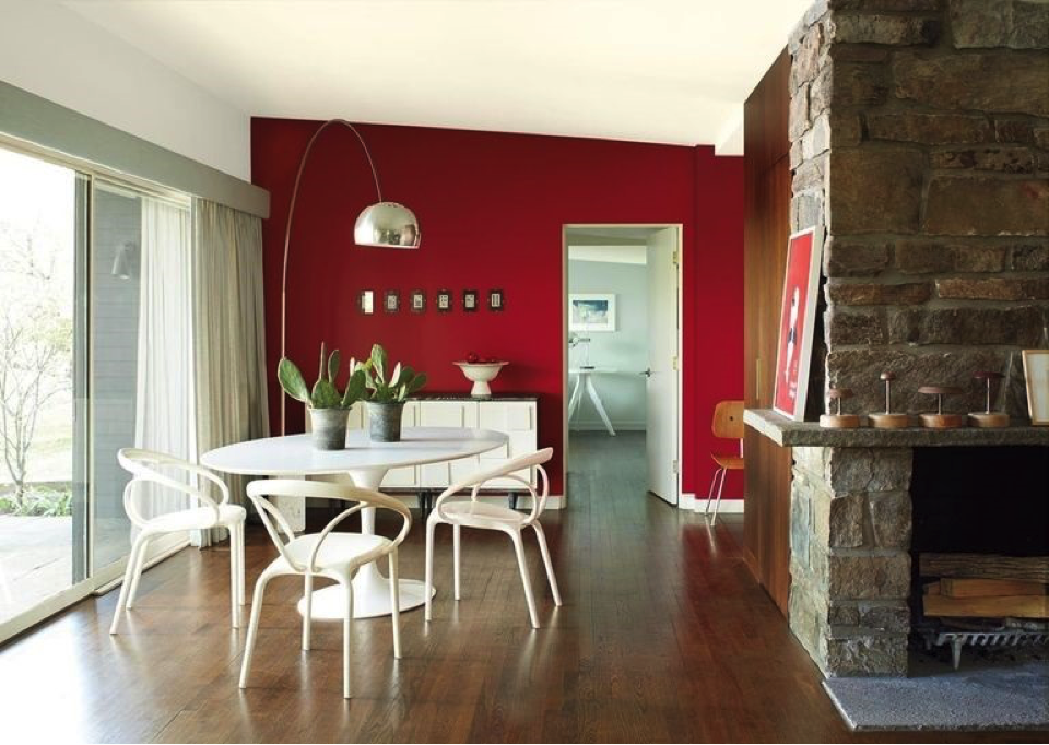
Caliente AF-290 is certain to add happiness into any room.
“Strong, radiant and full of energy, Caliente AF-290 is total confidence. It is pleasing, passionate and makes people feel special, like ‘red carpet treatment,'” said Ellen O’Neill, Benjamin Moore Director of Strategic Design Intelligence. “Whether used as one note or on four walls, the spirited personality of red turns heads signaling surprise and adventure. The eye can’t help but follow its bold strokes.”
SHERWIN-WILLIAMS’S 2018 COLOR OF THE YEAR “evokes optimism.”
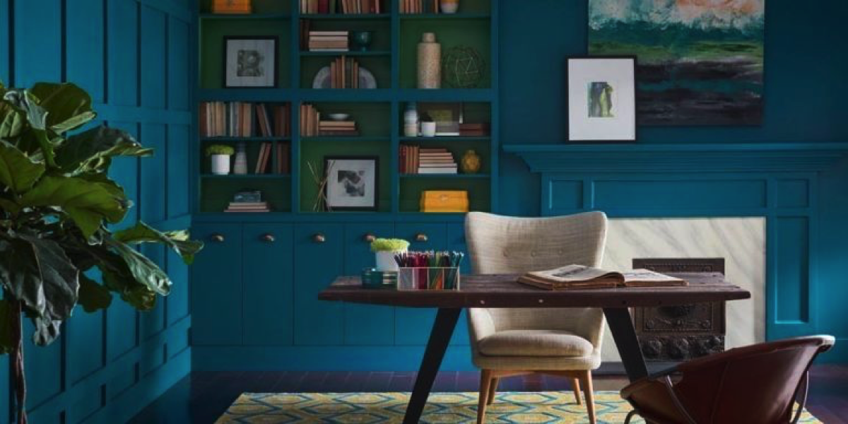
Sherwin-Williams also moved away from neutrals with their color pick for 2018. The firm says they wanted to capture the society’s desire for color that’s “both accessible and elusive.” The outcome is a profound shade called Oceanside.
“People today have a growing sense of adventure, and it is making its way into even the coziest corners of our homes. We are craving things that remind us of bright folklore, like mermaids and expeditions across continents,” says Sue Wadden, director of color marketing at Sherwin-Williams. “Oceanside is the color of wanderlust right in our own homes.”
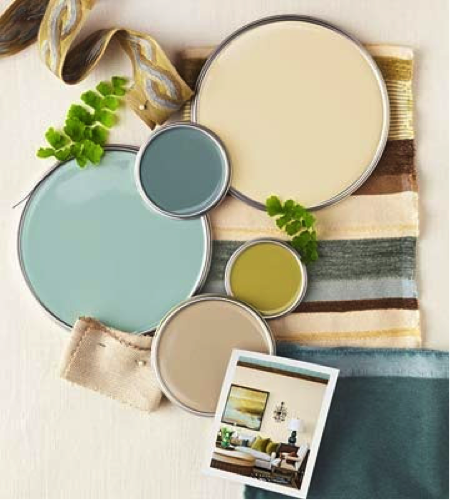 Interested in a professional color palette for your home?
Using color to create a home that welcomes and embraces its owners is our specialty.
We understand color and how it affects you emotionally and physically.
Transitioning colors from room to room is hard for most people but is super easy for us.
 MEET Marina – The Design Matchmaker
Designer Premier’s complimentary matching service will connect you with the right design professionals to remodel or build and design your dream home.
Video: Learn More about this Complimentary Service
Arrange a no Obligation, Complimentary Consultation
Call Marina 303.916.9515 /designerpremier.com
